Интерфейс Touch Memory (1-Wire, iButton)
Интерфейс для связи между считывателем и контроллером СКУД Touch Memory – это разработанная корпорацией Dallas Semiconductor (с 2001 года — Maxim Integrated) двунаправленная шина 1-Wire, где используются всего два провода для питания и передачи данных.
Второй по популярности интерфейс для систем контроля доступа после интерфейса Wiegand.
Принцип работы интерфейса Touch Memory в СКУД
В случае использования интерфейса iButton для связи между контроллером и считывателем, последний эмулирует поведение ключа и контактора. Таким образом осуществляется возможность использовать простую схему передачи данных и, одновременно, идентификатор лучше защищенный от считывания, чем ключ Touch Memory.
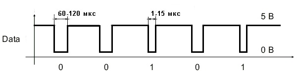
Для обмена данными между считывателем и контроллером интерфейс 1-Wire использует всего одну двунаправленную сигнальную линию (второй провод — заземление), по времени отсутствия напряжения на которой определяется содержимое бита данных.
Преимущества и недостатки использования интерфейса iButton
Говоря о преимуществах интерфейса Touch Memory отмечают, в первую очередь, минимальное количество жил для передачи сигнала.
В качестве преимущества для решения определенных групп задач можно назвать возможность контроля удержания карты перед считывателем.
Некоторые производители реализуют двустороннюю связь считывателя и контроллера СКУД на базе протокола iButton.
Недостатками интерфейса 1-Wire являются:
- из-за низкой помехоустойчивости протокол Touch Memory эффективен лишь при небольшом расстоянии между считывателем и контроллером, которое может быть увеличено только с усложнением монтажа и с увеличением обшей стоимости системы контроля доступа;
- проблемы совместимости оборудования различных производителей, за счет отсутствия стандартизации процессов передачи сигнала;
- отсутствие шифрования передаваемых данных;
- отсутствие контроля целостности линии.
Материал спецпроекта «Без ключа»
Спецпроект «Без ключа» представляет собой аккумулятор информации о СКУД, конвергентном доступе и персонализации карт
2Считывание идентификатора ключа iButton с помощью Arduino
Для работы с интерфейсом 1-wire существуют готовые библиотеки для Ардуино. Можно воспользоваться, например, этой. Скачиваем архив и распаковываем в папку /libraries/, расположенную в каталоге Arduino IDE. Теперь мы можем очень просто работать с данным протоколом.
Загрузим в Ардуино стандартным способом этот скетч:
Скетч чтения ключа iButton с помощью Arduino (разворачивается)
#include <OneWire.h>
OneWire iButton(10); // создаём объект 1-wire на 10 выводе

void setup (void) {
  Serial.begin(9600);
}

void loop(void) {
  delay(1000); // задержка 1 сек
  byte addr; // массив для хранения данных ключа

  if ( !iButton.search(addr) ) { // если ключ не приложен
      Serial.println("No key connected..."); // сообщаем об этом
      return; // и прерываем программу
  }

  Serial.print("Key : ");
  for(int i=0; i}
Данный скетч показывает номер ключа для домофона, который подключён к схеме. Это то, что нам и нужно сейчас: мы должны узнать номер ключа, копию которого хотим сделать. Подключим Ардуино к компьютеру. Запустим монитор последовательного порта: Инструменты Монитор последовательного порта (или сочетание клавиш Ctrl+Shift+M).
Теперь подключим ключ к схеме. Монитор порта покажет номер ключа. Запомним этот номер.
Запоминаем номер ключа iButton, выводимый в монитор последовательного порта
А вот какой обмен происходит на однопроводной линии при чтении идентификатора ключа (подробнее – далее):
Диаграмма взаимодействия ключа Dallas с Arduino по однопроводному интерфейсу (1-wire)
На рисунке, конечно, не видны все детали реализации. Поэтому в конце статьи я прикладываю временную диаграмму в формате *.logicdata , снятую с помощью логического анализатора и программы Saleae Logic Analyzer и открываемую ей же. Программа бесплатная и скачивается с официального сайта Saleae. Чтобы открыть файл *.logicdata нужно запустить программу, нажать сочетание Ctrl+O или в меню Options (расположено вверху справа) выбрать пункт Open capture / setup.
HTML Ссылки
HTML по АлфавитуHTML по КатегориямHTML Атрибуты ТеговHTML Атрибуты ГлобалHTML Атрибуты СобытийHTML ЦветаHTML ХолстыHTML Аудио / ВидеоHTML Наборы символовHTML DOCTYPEsHTML Кодирование URLHTML Языковые кодыHTML Коды странHTTP Ответы сервераHTTP МетодыPX в EM конвертерГорячие клавиши
HTML Теги
<!—>
<!DOCTYPE>
<a>
<abbr>
<acronym>
<address>
<applet>
<area>
<article>
<aside>
<audio>
<b>
<base>
<basefont>
<bdi>
<bdo>
<big>
<blockquote>
<body>
<br>
<button>
<canvas>
<caption>
<center>
<cite>
<code>
<col>
<colgroup>
<data>
<datalist>
<dd>
<del>
<details>
<dfn>
<dialog>
<dir>
<div>
<dl>
<dt>
<em>
<embed>
<fieldset>
<figcaption>
<figure>
<font>
<footer>
<form>
<frame>
<frameset>
<h1> — <h6>
<head>
<header>
<hr>
<html>
<i>
<iframe>
<img>
<input>
<ins>
<kbd>
<label>
<legend>
<li>
<link>
<main>
<map>
<mark>
<menu>
<menuitem>
<meta>
<meter>
<nav>
<noframes>
<noscript>
<object>
<ol>
<optgroup>
<option>
<output>
<p>
<param>
<picture>
<pre>
<progress>
<q>
<rp>
<rt>
<ruby>
<s>
<samp>
<script>
<section>
<select>
<small>
<source>
<span>
<strike>
<strong>
<style>
<sub>
<summary>
<sup>
<svg>
<table>
<tbody>
<td>
<template>
<textarea>
<tfoot>
<th>
<thead>
<time>
<title>
<tr>
<track>
<tt>
<u>
<ul>
<var>
<video>
<wbr>
Методы компонента Button
| Имя метода | Краткое описание | |
| BringToFront | Метод BringToFront располагает компонент на передний план. | |
| ClientToScreen | Метод ClientToScreen преобразовывает координаты точки, указанные относительно системы координат компонента, в экранные координаты. | |
| DoDragDrop | Метод DoDragDrop позволяет начать операцию перетаскивания. | |
| GetImage | Метод GetImage возвращает изображение компонента со всеми дочерними компонентами. | |
| ScreenToClient | Метод ScreenToClient преобразовывает экранные координаты точки в координаты, указываемые относительно системы координат компонента. | |
| SendToBack | Метод SendToBack располагает компонент на задний план. | |
| SetFocus | Метод SetFocus устанавливает фокус на данный компонент. |
Электронный ключ Touch Memory
Принцип работы
Популярные ключи Dallas Touch Memory, они же таблетки iButton, функционируют следующим образом.
В качестве считывателя выступает контактор, при соприкосновении которого с идентификатором замыкается электросхема и происходит передача на контроллер уникального 48-битного номера (+8 бит — код семейства, + 8 бит CRC — проверка) и на основании полученных данных принятие решения о допуске или отказе в доступе.
При этом таблетка Touch Memory выступает в качестве пассивного идентификатора, поскольку и питание, и опрос осуществляются через контроллер СКУД.
Конструктивные особенности таблеток iButton
Основой электронного ключа Touch Memory является, выполненный в виде таблетки диаметром 16 мм, герметичный корпус из нержавеющей стали, верхняя крышка которого электрически изолирована от нижней части при помощи полипропиленовой втулки. Толщина стали корпуса составляет 5,8 мм (корпус F5) или 3,2 мм (корпус F3). При этом верхняя крышка является контактом данных, а нижняя — общим контактом. Внутри корпуса размещается кремниевый чип (микросхема).
Эта конструкция обеспечивает высокую устойчивость ключей iButton к внешним воздействиям и неблагоприятным условиям окружающей среды. Например, они способны выдержать 11-килограммовую нагрузку на корпус, механический удар 500 г, падение с высоты 1,5 метров на бетонный пол. А, кроме того, могут работать в условиях повышенной влажности, не чувствительны к загрязнениям, вибрации и действию магнитных и статических полей. Рабочий диапазон температур составляет -40ºС до +85ºС для DS1990 и от -20ºС до +85ºС для остальных приборов семейства.
Достоинства электронных ключей Dallas Touch Memory
- небольшой размер;
- возможность работы в агрессивных условиях окружающей среды;
- высокая скорость считывания (менее 5 мс);
- простой и быстрый обмен данными по протоколу 1-Wire;
- идентификация по касанию;
- удобство совмещения ключа с контактором, за счет чашевидной формы последнего;
- возможность простого закрепления таблетки iButton на различных поверхностях или в различных аксессуарах.
Сфера применения iButton
В силу невысокой стоимости, надежности, простоты считывающих устройств и открытому протоколу этот тип iButton (DS1990) получил массовое внедрение в качестве электронного ключа в системах охранной сигнализации, разграничения доступа к информации и физическим объектам, электронным проходным, электронным замкам и в системах безопасности для банков и офисов.
Также применяется для маркировки объектов и маршрутов в системах контроля патрульно-постовой службы, контроля передвижения транспорта, системах инвентарного и складского учёта и в качестве кредитных карт в локальных платежных системах. Но наиболее частым применением идентификаторов Touch Memory остаются домофонные системы.
Недостатки использования электронных идентификаторов
- недостаточная защищенность ключа от изготовления дубликата;
- недостаточная защищенность контактора.
Самый главный из них – это недостаточная вандалозащищенность самого считывателя: воздействие элекрошокером, пьезозажигалкой, да просто скачок напряжения могут вывести прибор из строя.
Особенно печальные последствия могут быть от воздействия электрошокера у проводной клавиатуры: электрический разряд может уничтожить ПКП, нарушив работу всей системы. Да и вообще, считыватель можно просто-напросто замазать краской или залепить жвачкой.
Многие клавиатуры со считывателями Touch Memory не защищены от воздействия ключа-вездехода, иногда называемого «ключом почтальона», а это не добавляет надежности в работе системы. Ну и, наконец, ключ можно потерять, или, что достаточно часто случается у меня лично, теряется сама «таблетка», а пластиковый корпус остается, — говорит Мария ЛИВЕНЦОВА специалист по ОПС, компании «Альтоника».
Пример использования
<!DOCTYPE html>
<html>
	<head>
		<title>Тег <button></title>
	</head>
	<body>
		<button type = "button" name = "button1" style = "width: 80px; height:50px;">
			<b>Кнопка 1</b>
		</button><br><br>
		<button type = "button" name = "button2" style = "width: 80px; height:50px">
			<img src = "../../images/top2.png" alt = "up" width = "40" height = "40">
		</button><br><br>
		<button type = "button" name = "button3" style = "width: 80px; height:50px;">
			<i>Кнопка 3</i>
		</button><br><br>
	</body>
</html>
В данном примере мы разместили 3 кнопки, которым задали уникальные имена атрибутом name и с использованием внутренних CSS стилей указали ширину (width) размером 80 пикселей и высоту (height) размером 50 пикселей:
Текст внутри первой кнопки мы отформатировали жирным начертанием (тег )
Обратите внимание, что текст, который мы поместили внутри тега отображается на самой кнопке.
Внутри второй кнопки элементом мы разместили *.png изображение (с прозрачным задним фоном). Атрибутом alt мы задали альтернативный текст для изображения, для того случая если оно по каким-то причинам не будет загружено (обязательный атрибут), относительный путь к изображению мы задали атрибутом src (обязательный атрибут), атрибутами width (ширина) и height (высота) задали размеры изображения равными 40 на 40 пикселей
Обратите внимание, что в атрибутах, которые задают размер не требуется указывать единицы измерения в отличии от CSS стилей, по той причине, что атрибутами можно указать значение только в пикселях.
Текст внутри третьей кнопки мы отформатировали курсивным начертанием (тег ).
Результат нашего примера:
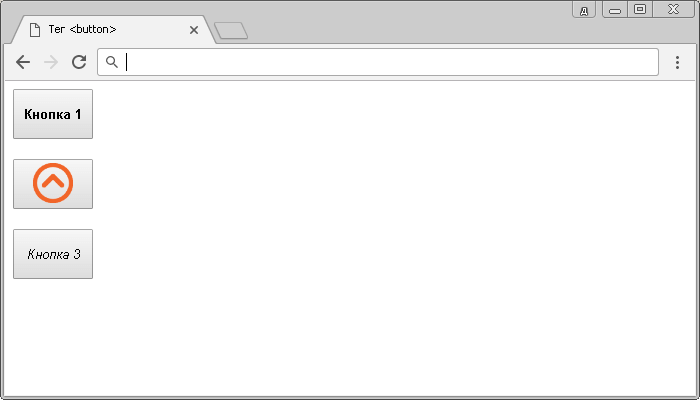
Пример использования тега <button> (кнопкa в HTML).
В следующем примере рассмотрено применение атрибутов, которые позволяют не производить проверку данных на корректность, введенных пользователем и задать браузеру, где показать ответ, полученный после отправки формы.
<!DOCTYPE html>
<html>
	<head>
		<title>Использование атрибутов formnovalidate и formtarget HTML тега <button></title>
	</head>
	<body>
		<form id = "myForm">
			<input type = "text" name = "ulogin" placeholder = "Ваше имя"><br> <!-- определяем элемент управления для текстовой информации -->
			<textarea name = "uquestion" cols = "35" rows = "5" placeholder = "Ваш вопрос"></textarea><br>
			<button formtarget = _blank formnovalidate>Отправить</button> <!-- определяем кнопку для отправки формы -->
		</form>
	</body>
</html>
В данном примере внутри формы мы создали два элемента <input>, предназначенные для ввода текстовой информации и ввода пароля, и кнопку (HTML тег <button>), предназначенную для отправки формы (тип кнопки submit по умолчанию). Кроме того, атрибутом formtarget со значением «_blank» указали, что при передаче формы ответ будет отображен в новой вкладке, а логическим атрибутом formnovalidate указали, что проверка данных на корректность, введенных пользователем в форму не производится.
Результат нашего примера:
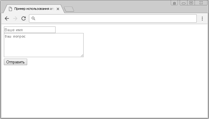
Пример использования атрибутов formnovalidate и formtarget HTML тега <button>.
Значение и применение
HTML тег <button> используется для размещения кнопки. Внутри тега <button> вы можете разместить как отформатированный текст, так и изображение. Это основная разница между этим элементом и кнопками, созданными с использованием тега <input> (c атрибутом type = «button»).
Всегда указывайте для тега <button> тип атрибута type = «button» если элемент используется в качестве обычной кнопки. Если вы используете тег <button> внутри HTML формы, то вы можете столкнуться с тем, что старые версии браузеров могут представить различные значения при отправке формы. Рекомендуется в этом случае использовать элемент <input> для отправки HTML форм.
Attributes
This element’s attributes include the global attributes.
- This Boolean attribute specifies that the button should have input focus when the page loads. Only one element in a document can have this attribute.
- This attribute on a is nonstandard and Firefox-specific. Unlike other browsers, Firefox persists the dynamic disabled state of a across page loads. Setting on the button disables this feature; see bug 654072.
-
This Boolean attribute prevents the user from interacting with the button: it cannot be pressed or focused.
Firefox, unlike other browsers, persists the dynamic disabled state of a across page loads. Use the attribute to control this feature.
-
The element to associate the button with (its form owner). The value of this attribute must be the of a in the same document. (If this attribute is not set, the is associated with its ancestor element, if any.)
This attribute lets you associate elements to s anywhere in the document, not just inside a . It can also override an ancestor element.
- The URL that processes the information submitted by the button. Overrides the attribute of the button’s form owner. Does nothing if there is no form owner.
- If the button is a submit button (it’s inside/associated with a and doesn’t have ), specifies how to encode the form data that is submitted. Possible values:
- : The default if the attribute is not used.
- : Use to submit elements with their attributes set to .
- : Specified as a debugging aid; shouldn’t be used for real form submission.
If this attribute is specified, it overrides the attribute of the button’s form owner.
- If the button is a submit button (it’s inside/associated with a and doesn’t have ), this attribute specifies the HTTP method used to submit the form. Possible values:
- : The data from the form are included in the body of the HTTP request when sent to the server. Use when the form contains information that shouldn’t be public, like login credentials.
- : The form data are appended to the form’s URL, with a as a separator, and the resulting URL is sent to the server. Use this method when the form has no side effects, like search forms.
If specified, this attribute overrides the attribute of the button’s form owner.
-
If the button is a submit button, this Boolean attribute specifies that the form is not to be validated when it is submitted. If this attribute is specified, it overrides the attribute of the button’s form owner.
This attribute is also available on and elements.
- If the button is a submit button, this attribute is a author-defined name or standardized, underscore-prefixed keyword indicating where to display the response from submitting the form. This is the of, or keyword for, a browsing context (a tab, window, or ). If this attribute is specified, it overrides the attribute of the button’s form owner. The following keywords have special meanings:
- : Load the response into the same browsing context as the current one. This is the default if the attribute is not specified.
- : Load the response into a new unnamed browsing context — usually a new tab or window, depending on the user’s browser settings.
- : Load the response into the parent browsing context of the current one. If there is no parent, this option behaves the same way as .
- : Load the response into the top-level browsing context (that is, the browsing context that is an ancestor of the current one, and has no parent). If there is no parent, this option behaves the same way as .
- The name of the button, submitted as a pair with the button’s as part of the form data, when that button is used to submit the form.
- The default behavior of the button. Possible values are:
- : The button submits the form data to the server. This is the default if the attribute is not specified for buttons associated with a , or if the attribute is an empty or invalid value.
- : The button resets all the controls to their initial values, like <input type=»reset»>. (This behavior tends to annoy users.)
- : The button has no default behavior, and does nothing when pressed by default. It can have client-side scripts listen to the element’s events, which are triggered when the events occur.
- Defines the value associated with the button’s when it’s submitted with the form data. This value is passed to the server in params when the form is submitted using this button.
Switch Applications
On/Off Control
Among the most obvious of switch applications is simple on and off control. The type of control you perform every time you walk into a dark room. An on/off switch can be implemented by simply sticking an SPST switch in series with a power-line. Usually the on/off switch will be maintained, like a toggle or slide switch, but momentary on/off switches can have their purpose.
On this Breadboard Power Supply, an SPDT switch is used to turn the circuit on and off. (A second SPDT switch is used to select the adjustable voltage regulator’s output value by adjusting a voltage divider.)
When implementing such a switch, keep in mind that all the current your project consumes is going to run through that switch. Ideally a switch is a perfect conductor, but realistically it’s got a small amount of resistance between the two contacts. Because of that resistance, all switches are rated for a maximum amount of current they can withstand. Exceed a switch’s maximum current rating, and you can expect melted plastic and magic smoke.
For example, this SPDT slide switch is great for controlling current flow in small projects (like Simons or Metronomes), but don’t try using it to control beefy motor controllers, or strings of 100 LEDs. For that, consider using something like a 4A toggle switch or a 6A lamp switch.
User Input
Of course, user input is one of the more common applications for switches. For example, if you want to connect a switch to a microcontroller input pin, a simple circuit like this is all you’d need:
Attributes
| Attribute | Value | Description |
|---|---|---|
| autofocus | autofocus | Specifies that a button should automatically get focus when the page loads |
| disabled | disabled | Specifies that a button should be disabled |
| form | form_id | Specifies which form the button belongs to |
| formaction | URL | Specifies where to send the form-data when a form is submitted. Only for type=»submit» |
| formenctype | application/x-www-form-urlencoded multipart/form-data text/plain |
Specifies how form-data should be encoded before sending it to a server. Only for type=»submit» |
| formmethod | getpost | Specifies how to send the form-data (which HTTP method to use). Only for type=»submit» |
| formnovalidate | formnovalidate | Specifies that the form-data should not be validated on submission. Only for type=»submit» |
| formtarget | _blank _self _parent _topframename |
Specifies where to display the response after submitting the form. Only for type=»submit» |
| name | name | Specifies a name for the button |
| type | button reset submit |
Specifies the type of button |
| value | text | Specifies an initial value for the button |
HTML Tags
<!—><!DOCTYPE><a><abbr><acronym><address><applet><area><article><aside><audio><b><base><basefont><bdi><bdo><big><blockquote><body><br><button><canvas><caption><center><cite><code><col><colgroup><data><datalist><dd><del><details><dfn><dialog><dir><div><dl><dt><em><embed><fieldset><figcaption><figure><font><footer><form><frame><frameset><h1> — <h6><head><header><hr><html><i><iframe><img><input><ins><kbd><label><legend><li><link><main><map><mark><meta><meter><nav><noframes><noscript><object><ol><optgroup><option><output><p><param><picture><pre><progress><q><rp><rt><ruby><s><samp><script><section><select><small><source><span><strike><strong><style><sub><summary><sup><svg><table><tbody><td><template><textarea><tfoot><th><thead><time><title><tr><track><tt><u><ul><var><video>
What is a Switch?
A switch is a component which controls the open-ness or closed-ness of an electric circuit. They allow control over current flow in a circuit (without having to actually get in there and manually cut or splice the wires). Switches are critical components in any circuit which requires user interaction or control.
A switch can only exist in one of two states: open or closed. In the off state, a switch looks like an open gap in the circuit. This, in effect, looks like an open circuit, preventing current from flowing.
In the on state, a switch acts just like a piece of perfectly-conducting wire. A short. This closes the circuit, turning the system «on» and allowing current to flow unimpeded through the rest of the system.
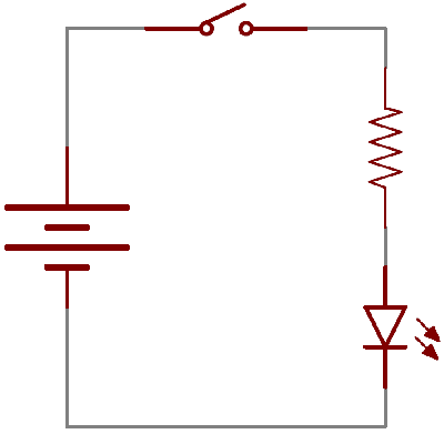
A circuit diagram with an LED, resistor, and a switch. When the switch is closed, current flows and the LED can illuminate. Otherwise no current flows, and the LED receives no power.
Процесс прошивки
Рекомендуется сначала прошить бутлоадер из директории «Bootloader», чтобы потом иметь возможность обновлять прошивку по USB, без подключения программатора. Бутлоадер сконфигурирован так, что режим обновления прошивки будет включаться, если при запуске (не при пробуждении!) устройства зажата кнопка (она одна), при этом в режиме бутлоадера будет гореть средний светодиод.
Фьюзы:
- Low: 0xE4
- High: 0xDA
После запуска бутлоадера для обновления или первичной установки прошивки нужно просто подключить устройство по USB, определить его виртуальный COM порт, вписать его в Makefile и набрать «make program».
Если бутлоадер не нужен, то сразу прошивать основную прошивку, используя фьюзы:
- Low: 0xE4
- High: 0xD9
Defining Characteristics
Actuation Method
In order to change from one state to another, a switch must be actuated. That is, some sort of physical action must be performed to “flip” the switch’s state. The actuation-method of a switch is one of its more defining characteristics.
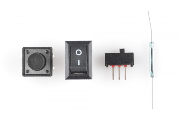
Some examples of switch types. Push button, rocker, slide, and magnetic.
Switch actuation can come from pushing, sliding, rocking, rotating, throwing, pulling, key-turning, heating, magnetizing, kicking, snapping, licking,…any physical interaction which can cause the mechanical linkages inside the switch to come into, or go out of, contact.
Momentary vs. Maintained
All switches fall into one of two distinct categories: momentary or maintained.
Maintained switches — like the light switches on your wall — stay in one state until actuated into a new one, and then remain in that state until acted upon once again. These switches might also be called toggle or ON/OFF switches.
Momentary switches only remain active as long as they’re actuated. If they’re not being actuated, they remain in their “off” state. You’ve probably got a momentary switch (or 50) right in front of you…keys on a keyboard!
Semantic alert! Most of the switches we refer to as «buttons» fall in the momentary category. Activating a button usually means pressing down on it in some manner, which just feels like a momentary control. There are such things as a maintained button, but for this tutorial when we slip and talk about «buttons», think “momentary push-down switch”.
Mounting Style
As with most components, the termination style of a switch always comes down to either surface mount (SMD) or through-hole (PTH). Through-hole switches are usually larger in size. Some might be designed to fit in a breadboard for easy prototyping.
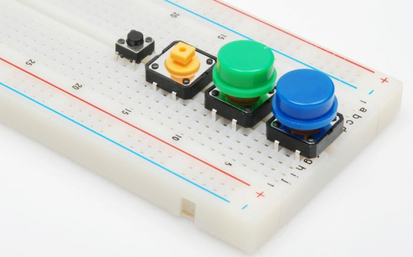
These Tactile buttons are through-hole and fit perfectly in a breadboard. Great for prototyping!
SMD switches are smaller than their PTH counterparts. They sit flat, on top of a PCB. SMD switches usually require a gentle touch, they’re not built to sustain as much switching force as a through-hole switch.
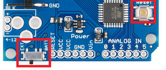
The Arduino Pro has two SMD switches: a slide switch for power control, and a push-button for reset control.
Panel mount switches — designed to sit outside an enclosure — are a popular mounting style as well. It’s hard to flip a switch when it’s hidden inside an enclosure. Panel mount switches come in all sorts of termination styles: PTH, SMD, or heavy-duty solder lugs for soldering to wires.
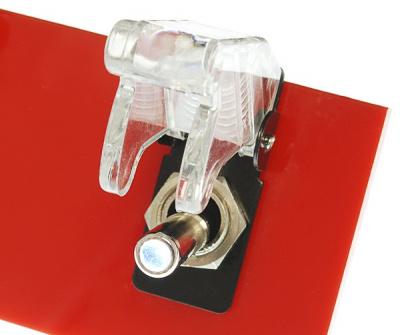
A panel mounted illuminated toggle switch.